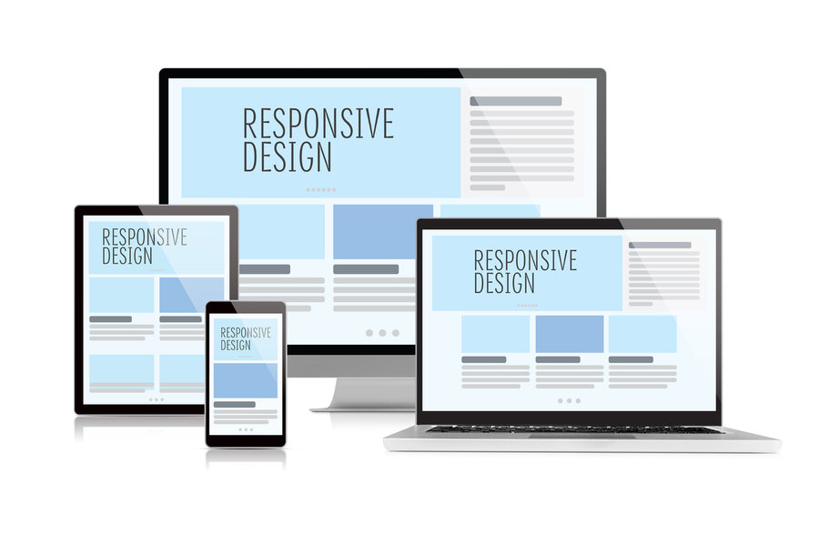
Today, more than half of users access the internet from mobile devices — smartphones and tablets. This changes the approach to website development: to be successful, an online store must work quickly and conveniently specifically on these devices. Mobile version and responsive design are not just trendy but key factors for increasing conversion rates, retaining customers, and growing sales.
Responsiveness means that the site's content and structure automatically adjust to the user's screen size — text and images scale, the menu becomes convenient, and pages load quickly. The Hotlist.biz platform uses a modern approach to layout — block elements DIV are used instead of outdated tables. This simplifies creating flexible layouts and speeds up page loading.
Additionally, loading speed of the mobile version is critical — users often use mobile internet with limited bandwidth. To avoid losing customers, the site must load quickly and minimize unnecessary server requests.
Block Layout and Its Advantages
Build templates based on block layout. This means that each element of the page is a separate block with specific styles and behavior. Such a structure provides the following advantages:
- Flexible adaptation to any screens and devices;
- Easy management of block visibility (e.g., hiding side menus on mobile devices);
- Faster loading due to dynamic content loading;
- Convenience of adding new features and elements without a full template overhaul.
In the template structure, it is recommended to use the main semantic blocks:
<header> — top part of the site with logo and menu,
<main> — main content of the page,
<aside> — side panels and additional elements,
<footer> — bottom block with contacts and links.
In Hotlist.biz, each block can be output with the desired HTML tag type, allowing flexible management of the page structure and meeting design and semantic requirements without manually editing the code.
This enables creating a high-quality user interface that considers the needs of mobile users.
Image Optimization
To prevent layout shifts when loading pages, it is recommended to specify image sizes in advance. Use loading="lazy" to defer image loading until they actually appear in the user's viewport. On the Hotlist.biz platform, all of this can be configured in the site settings.
For faster display of product lists, Hotlist.biz uses reduced, cached copies of images. If additional images exist on a product card, it is recommended to load them only when the user interacts with the card (e.g., on hover or when the card enters the visible area of the page) to avoid unnecessary requests.
Use modern image formats, such as WebP, which provide high quality at smaller file sizes compared to JPEG or PNG. Adjust compression to reduce file size without noticeable quality loss — excessive compression can spoil the appearance and break the design.
For product lists and previews, it is recommended to create reduced versions of images optimized for block size, while for large banners or full-screen photos, use sizes corresponding to the actual display on the page.
Dynamic Script Loading: Only When Needed
The Hotlist.biz platform employs an advanced JavaScript loading mechanism — all scripts are loaded and activated only if the user interacts with corresponding site elements or if the page contains objects requiring script operation. This significantly reduces site load and speeds up loading time.
For example, scripts responsible for pop-ups, changing product quantities in the cart, managing product variations on the product page, the mobile menu, and almost all other interactive features run only upon user clicks or when required elements are present on the page. This approach ensures maximum performance and comfort for visitors, especially on mobile devices with limited resources.
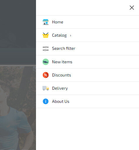
Mobile Menu as an App: Convenience and Functionality
The Hotlist.biz platform offers a powerful tool — a mobile menu that works like a full-fledged application. It can be flexibly customized so navigation is as simple and pleasant as possible for users on any device.
You set the screen width threshold at which the menu automatically switches to mobile mode (for example, for smartphones and tablets). You can also choose icons for the top block (cart, search, personal account, contacts, and more) and build the menu structure from categories, manufacturers, and any pages.
A key feature is optimized loading. If the menu contains many items and submenus, they are dynamically loaded only when expanded, not immediately on page load. This reduces server load and speeds up the site.
Built-in Mobile Menu Widget on Hotlist.biz Platform
On the Hotlist.biz platform, there is a mobile menu widget that is flexible to manage and allows creating menu items and sub-items with many parameters. For each top-level item, you can set an icon, color, and background. When clicking any menu item with a dropdown list of sub-items or the main menu, you can customize its color, icon, and include categories, subcategories, and manufacturer lists, which are loaded automatically without manual updates when site data changes. Each item can have its own individual icon.
The widget contains display parameters for the mobile menu block: left, right, center, or full screen. You can also set the screen width threshold at which the mobile menu is activated or enable it by default on all site pages.
Menu loading is optimized: initially, only the button and minimal functionality are loaded, and the full menu script with dropdown lists and pop-up windows is loaded only when clicked. If the screen is smaller than the specified width threshold for displaying the mobile menu, the script is not loaded, saving resources and increasing loading speed. The menu content is stored in a separate cacheable file and loaded only when opening the corresponding item, which further reduces server load and speeds up site performance.
Advanced Mobile Menu Features
The mobile menu supports special links with additional functions:
close— menu close button;- empty value — separator;
filter— product type selection block for search filter;#filter— calls the search filter window on the current page;#form-XX— loads popup form by ID;#form-call-XX— callback popup form;#ajax_page— loads HTML content by relative path.
For example, to add a "Contacts" icon, create a contacts page and specify the path /ru/contacts.htm#ajax_page (replace "ru" with the needed language).
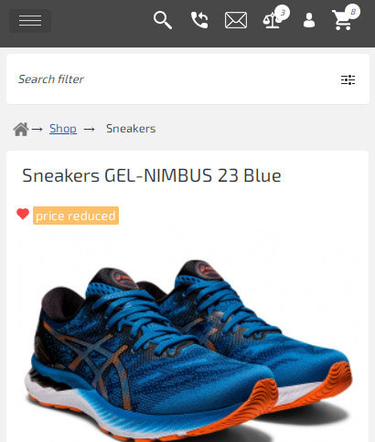
Search Filter for Mobile Users
You can create product types and menu functional blocks with search filters by specifying pages where they will appear. In mobile menu settings, specify block IDs named smart_search_menu, and the system will automatically add the filter to the mobile menu.
For example, a menu item with the link /en/pers_shop/sneakers/#filter will open the search filter window on click, making product search convenient on mobile devices.
Activation and Display of the Mobile Menu
The mobile menu can be enabled automatically at a specified screen width or always shown on all devices. The menu can be attached to a button or displayed as a top horizontal panel resembling a mobile app — choose the option that best suits your store.
If the mobile menu is not activated, by default the main menu shows a single button that opens a list instead of multiple buttons — a convenient adaptive option without a full mobile menu.
Additional Settings and Optimization
You can hide certain template elements in the mobile menu — logo, header, search menu, and others — to make the interface as clean and convenient as possible.
Optimization and accelerated loading of scripts
Scripts for the mobile menu and other functions (managing products in cards, quantity changes when adding to cart, pop-ups, etc.) load only as needed, minimizing load and speeding up site performance.

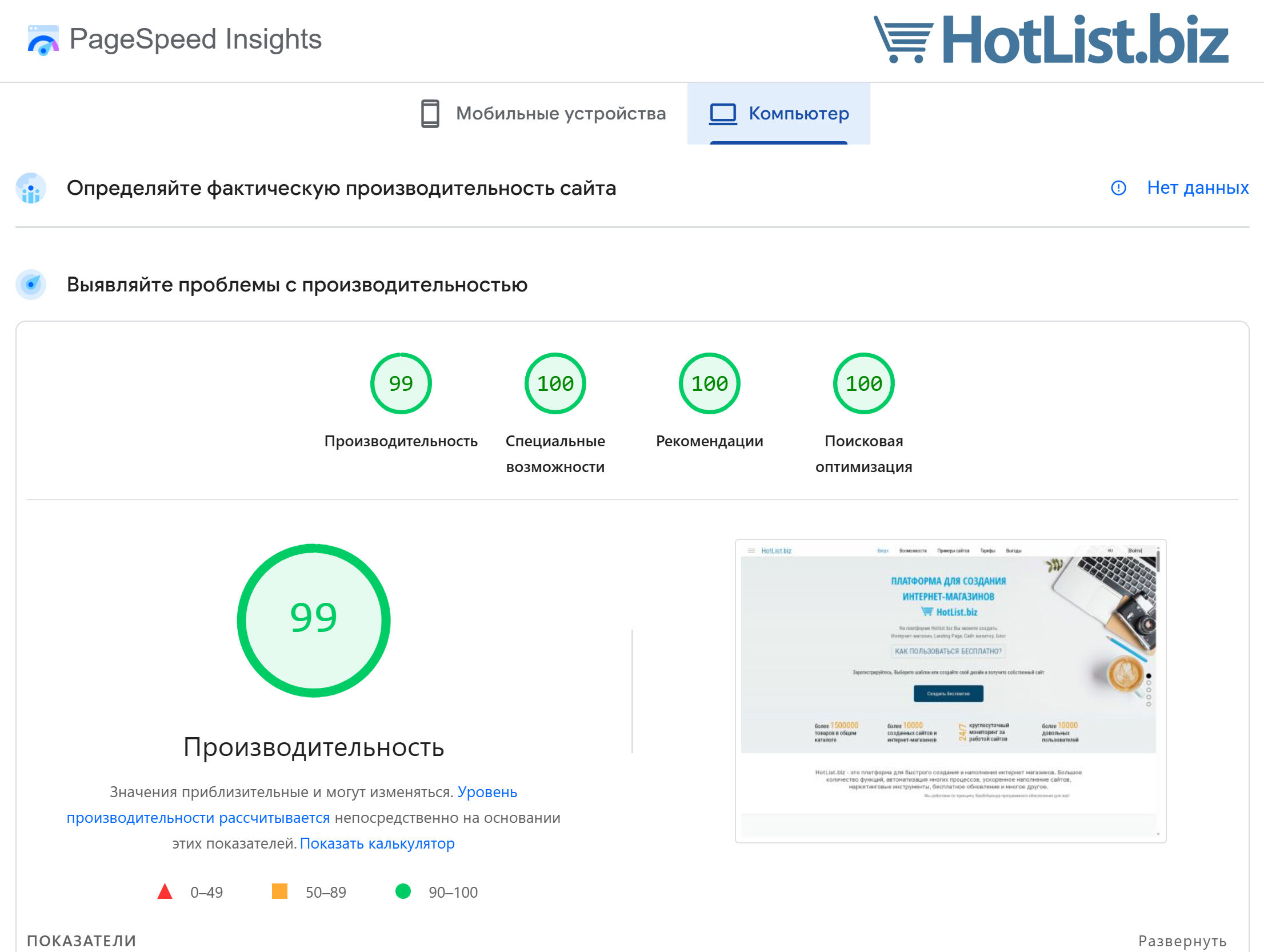
 PageSpeed Insights
Our actual score for optimization – 99%, 100%, 100%, 100%, which is practically a fantastic result.
Responsiveness, mobile version, and high loading speed are key success factors for an online store. The Hotlist.biz platform offers modern solutions based on block layout and dynamic loading, and the mobile menu allows you to create a convenient and functional interface for mobile users.
Use Hotlist.biz tools to make your online store fast, convenient, and attractive for customers on any device.
Complete guide to speed optimization for e‑commerce